GLOBAL NAVIGATION


Sub Image

- Site Location
- HOME > Company > Corprate Identity


The symbol of Taeyoung is based on "Sprit of customer value creation" which means the customer is a priority in order to reflect Taeyoung's management philosophy that customer developing propels the company forward. The symbol of Taeyoung "Creative-Window" symbolize appearance of catching composition using thumb and forefinger of both hands. It means that understand customer's needs constantly as to provide and create new living value to customers. Square shape of symbol symbolize Taeyoung's management philosophy that practice trust, respect, principle, honesty to 4 big customer (consumer, stockholder, employee, public) on 4 big.
core business filed (construction, broadcasting, logistics/trading, leisure). Rounding shape of symbol symbolize Taeyoung's spirit of challenge and creation as to create the best customer value. Wine color is reflected Taeyoung's spirit of intelligence and passion as to provide plenties and nobility.

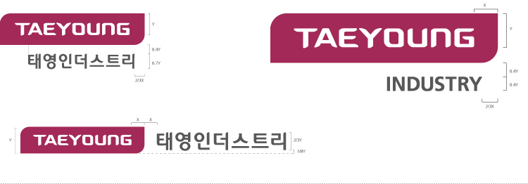
The signature combined symbol and logotype of Taeyoung Industry is formal designation method which shows formativeness and unification. To use the signature, should follow below combination rules.